ShopDreamUp AI ArtDreamUp
Deviation Actions


Description


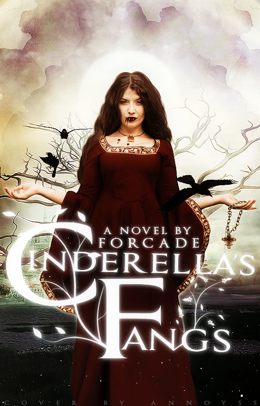
So I made this for my friend
 on Wattpad because I made a cover for her previously and I am absolutely horrified by what I made for her a while back.
 Credits
Model | 250
Background| background stock367, background stock376, background stock364
Necklace | Gothic Cross Necklace
Birds | Free Stock Flying Black Raven
Blood | Dripping Ink Brushes, Vampires teeths PNG
Texture | Burnt Paper // TEXTURES
Image size
512x800px 787.54 KB
© 2016 - 2024 annoyss
Comments3
Join the community to add your comment. Already a deviant? Log In
HISTORY
I am aware of Cinderella and other interpretations. I also enjoy good quality book covers. It seems like that art was lost long ago. Heck I remember when Fabio used to grace the cover of every book geared towards women back in the day.
ORIGINALITY
Book - I don't know. There's a lot of Cinderella stories out there so a new one with a vampire twist...that would have to be something spectacular because I;'m not quite sold on it so far.
ART COVER - Seriously good! I had difficulty discerning between art and realism if not for other pics. The atmosphere created is macabre and dark and suggests and underlying tone for the story. Excellent!
TECHNIQUE - I don't know how you spun this magic but you did a wonderful job creating a realistic background. The crows bring it home for me. I can almost hear their cawing at the darkness that resides within the story. I also enjoy the white nature growing out of the text that clashes against the barren nature of the background.
IMPACT - It stopped me enough because it stood out amidst a plethora of stuff looking to be critiqued. I think that speaks volumes.
PERSONAL THOUGHTS
I understand the need for public accreditation of your art and efforts but the placement of your credentials is distracting. Is there a better less bold in your face place to have your credentials?
Maybe put a novel by forcade where your credentials are at and put your credentials in the bottom right corner? Just my taste on it.
Who knows maybe it was specifically requested to be done that way I don't know.
All in all it's a great art cover and definitely I think would pull some eyes on a bookshelf.